Showing posts with label Cards. Show all posts

Friday, June 12, 2015

Star Wars Light Saber Father's Day Card

This is the Star Wars themed Father's Day card I made for my husband in 2014.  My original idea was that I would be able to change out the glow sticks. I painted the plastic holders black and glued them to the card. I didn't glue the glow sticks but they kept rolling off the card and therefore, was forced to glue them down. Another mistake I made was I didn't buy fresh glow sticks. They glowed but not very well in the dark. I should have tested the sticks before Father's Day. I was actually finishing up this card the morning of right before church and didn't have time to run out and buy new sticks. Oh well, live and learn.  It still turned out pretty nice if I say so myself.  

Sources:  Tim Holtz stickers, Dollar Tree glow sticks, glitter paper from Joann's


Old glow sticks don't glow very well in the dark. 

inside of card

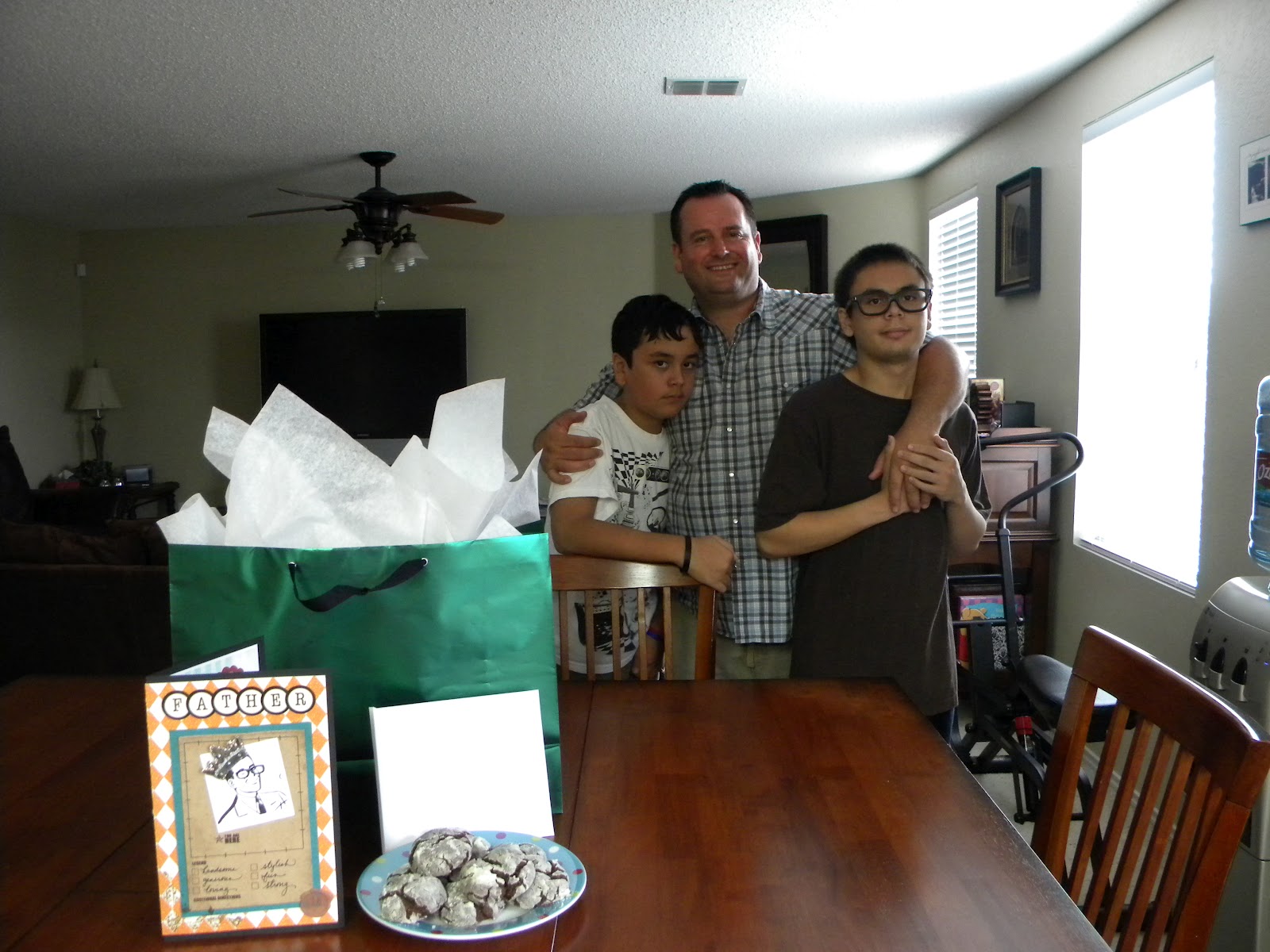
My children do not smile for pictures. It drives me mad. 

Monday, October 20, 2014

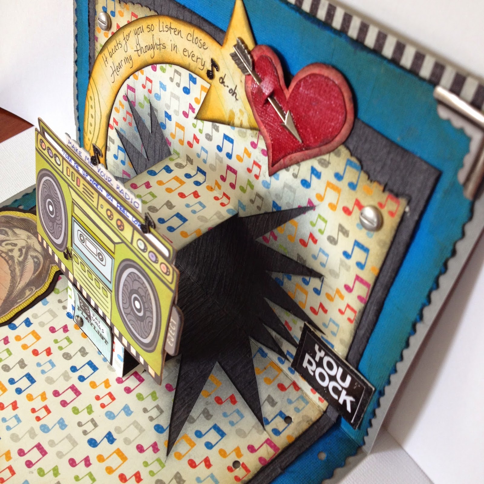
Stereo Hearts Pop-Up Card

This is the card I made for my husband in celebration of our 23rd anniversary. My inspiration is the song "Stereo Hearts" by Gym Class Heroes featuring Adam Levine.


 My original idea was a plain white card like this
with music notes. It should have been a one-day-easy-peasy project.


But for some reason I can't seem to do simple. My quick card turned into a big project because I just happened to come across a pop-up card on Pinterest and I thought it would be fun to make a pop-up card. I wasn't sure how to do it because the link on Pinterest was to a person who used a pop-up die set and didn't show the die cut. But I remembered I made a pop-up card in elementary so I knew it couldn't be too difficult. I used a piece of junk mail that was about the size of a card to experiment on how to cut the pop out.  

To make pop-up panel fold a piece of cardstock paper in half and cut 2 slits about 1 1/4" down from the folded edge. How far apart the slits are depend on the size of the object you will be placing on the pop-up panel.  Open the card and push the middle of the paper through the crease to opposite side.  
Please ignore the smaller rectangle cut-out in the middle of the card. 
I was thinking about doing a second pop out on top of the first pop out.


After cutting the slits I decided to cut out the pow symbol triangles along the sides to give the
 pop-up more oomph.

When you glue the paper make sure you DO NOT GLUE the panel that will pop out. 


K&Company for the stereo and the man with the big mouth. 

The pic below might be confusing but I want to show this step. The jambox is a sticker and when I attached it to the pop-up panel there was still quite a bit of the sticky back showing. I covered the exposed sticky back with striped masking tape so it wouldn't stick to the card preventing a pop-up fail. 


For the front of the card  I couldn't find a heart that I wanted in my gigantic stash of stickers or at the stores so I decided to make my own heart. Now I've had grunge board in my possession for years but I have never actually used it. After watching Tim Holtz's videos on grunge paper I was a bit overhwhelmed so I stayed away from it. I thought I had no use for grunge board. But I found it it's actually just pliable cardboard that won't rip or tear when you bend it nor will it fall apart when you get it wet.

Ink your cut out prior to embossing because the powder may not cover everything. 

 
I wanted to add one more layer to heart so I used Tim Holtz texture stamp.

It doesn't look like it made a huge difference but it was worth a try. 

I used alcohol ink to stain silver stars. This is a before and after. 


Adding the crystal embellishments was a pain in the butt. I was using tweezers to try to place them on the heart but it was very difficult. I finally used the tip of the exacto knife and my finger to get the crystals in place. 

This was a lot of work for one little ol' heart but it was worth it for my love.

I had this orange arrow that I wanted to use but it was facing the wrong direction. I just traced it upside down on another paper and and cut it out. Added the Distress Inks. 

 
This big-mouth man was plain so I colored him with chalk. 
It took several attempts to get the lyric words small enough to fit in the space between the jambox handles but I finally got it after I traced the space inside and fit the words in.

The 23 fav songs represents our 23 years together. I compiled 23 songs that remind me of my husband and put it in this small envelope on the back because the inside was already very busy. 


Distress Ink colors:  orange marmalade, fire brick red, vintage photo, black soot, antique linen.
The music notes paper comes from 


Disclaimer:  I do not know what I'm doing. Every time I make a card or scrapbook it is always an experiment. Sometimes I have happy accidents and sometimes it is a complete failure that I cover up with paper and embellishments.

Wednesday, October 31, 2012

CTRL + Z Apology Card

CTRL + Z on the keyboard is the undo function. Unfortunately, it can only be applied to keyboard applications and not our our lives. I would be a billionaire if I could figure out how to create an UNDO function for our careless actions or build a time machine. But having an UNDO function might possibly cause people to be more careless and have a flippant attitude so it's probably best that there is not one available.

In life we make awful mistakes than can't be undone and no matter how much we wish we could undo our wrong it is too late.  The only thing we can do is learn from our mistakes and not repeat them.  This is an apology card I made for my husband.  I'm not Jewish but I decided to give it to him on Yom Kippur - day of atonement.

My inspiration came from a CTRL + Z card on Pinterest, but it was just a plain card with the letters on the front.


rough draft


Supplies:  Cricut "From My Kitchen" for oval, Cricut Learning Curve for letters, Tim Holtz/idea-ology metal accents, Making Memories vintage flowers, Tim Holtz/Stampers Anonymous "Flights of Fancy" stamp


Tuesday, June 26, 2012

Father's Day Card

It is easier for a father to have children than for children to have a real father.

I made this card for my husband who is an amazing father!  My children are so blessed they have a loving, generous, funny, and cheerful dad who is able to blend the roles of fatherhood and friend effortlessly.  My husband is my inspiration.  One would never guess that he didn't grow up with a father or has been on his own since the tender age of 15. He is very grounded, easy going, and always puts our needs ahead of his own. One would think he had a remarkable dad as a role model.  I love that our children are growing up in a happy home with a dad who takes a keen interest in their lives and guides their moral values.  I can only hope that the  boys will be as great a father as their daddy.


The image of dad is from The Graphics Fairy's  May 23, 2012 post of Retro Father's Day Images.
God bless Karen for being so generous with her time and blog. I am so grateful for her free graphics.  
I took the image of the man being served breakfast and cropped it until I got his image of the head.  The expression is just perfect.

 Inside of card without the tags.


tags

I used Nifty Fifties Cricut cartridge for "daddyo".
Chocolate Crinkle Cookies for daddy.
The tool box card sings a song about Dad can fix anything with duct tape.


Supplies:  My Mind's Eye Life Journaling Sheet #1, Core dinations Pine Needles Distressed paper, Bottle Cap Stickers, Jolee's Boutique dimensional trophy sticker, 7 gypsies Little Tags, Cricut cartridge Nifty Fifties, Eyelet Outlet eyeglasses, Stickles Platinum, and I cut one crown from Jolee's Boutique crown border sticker.

This post was shared at 

Tuesday, December 13, 2011

Alice in Wonderland Teacup Card

It's December and every weekend in my calendar has already been filled with plans. After being sick for a month I've just started feeling slightly "normal" again. Unfortunately, now that I feel better I have become aware of the state of my house and closet which made me feel bad all over again. You know when you're sick you really don't care about the state of the house. So when you feel better you're like "Ugh! My blinders are gone!!" It's Christmas time and it's a season of having fun so I decided to ignore the dust and make my sister a birthday card instead. 

Since I couldn't find any teacups in my Cricut cartridges I googled "teacup templates" and found many images.  After going through several sites I found this pretty teacup template through a blog hop.  The creator is Melisa Waldorf. I am always so grateful when people share their cool stuff for free.


 I printed this out and enlarged it on my printer to 180%. 

 I traced the template onto a pretty piece of paper and cut it out using both scissors and an exacto knife.
 Shade the edges.
 My first screw up is choosing thin paper instead of cardstock.  I had to add another layer of paper inside so the paper would not curl. 
I also used Stickles Platinum on the edges.

 I used foam dots so Alice would be more prominent.
Alice is from Disney Classics Cricut cartridge.  The flowers are buttons I got on sale at Aaron Bros.

My sister is 46 years old but people always tell her that she looks like she's in her late 20s or early 30s so I decided to make her youth be the subject of the card.  I used regular glue for the vellum on the bottle which I found out was a big mistake. There's a special vellum glue I'm supposed to use.  Oh, the trials and errors of scrapbooking.  I covered my mistake with glitter which turned out better.

inside
backside
outside


This card was shared at:


Delectable Home

Related Posts Plugin for WordPress, Blogger...