This is the card I made for my husband in celebration of our 23rd anniversary. My inspiration is the song "Stereo Hearts" by Gym Class Heroes featuring Adam Levine.


My original idea was a plain white card like this

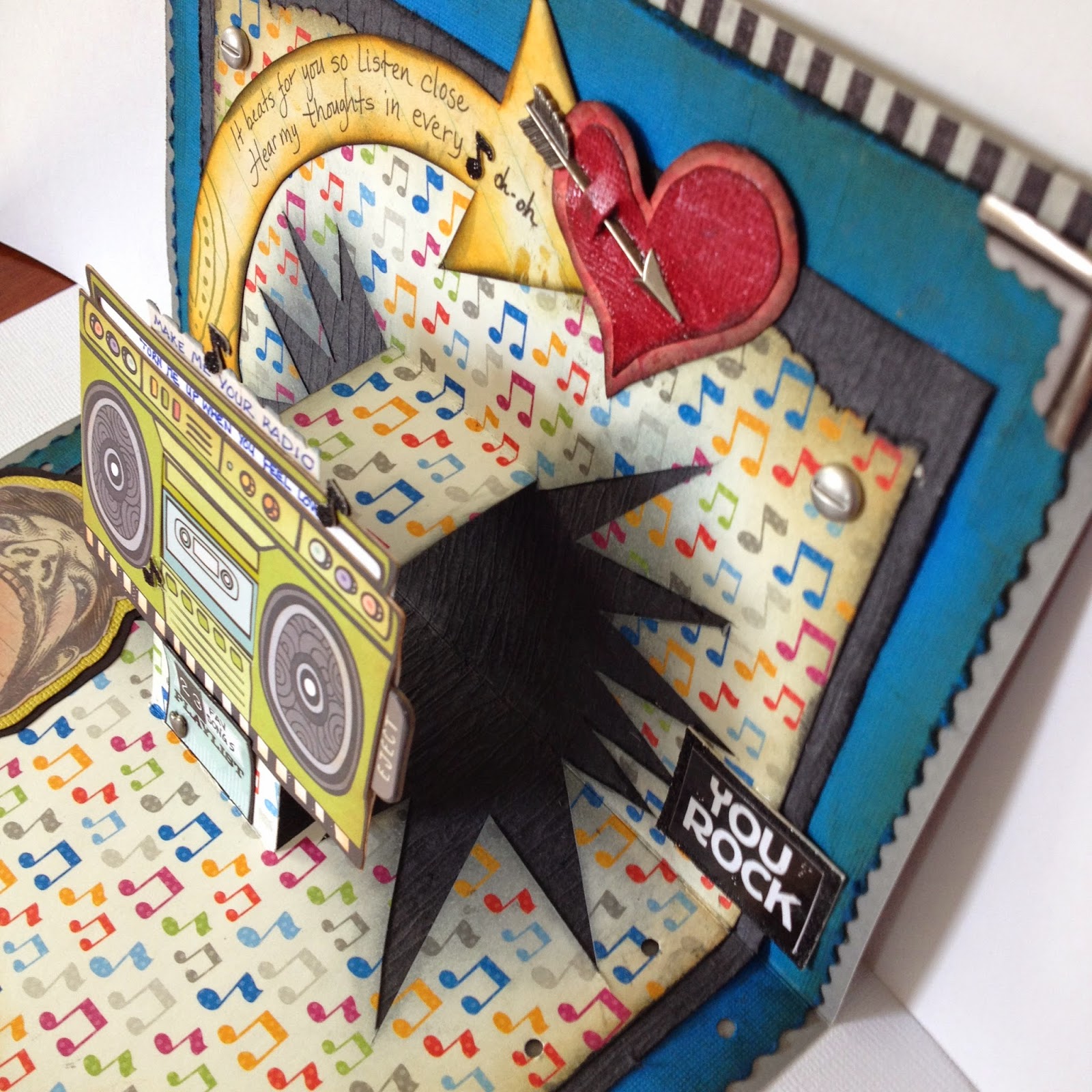
But for some reason I can't seem to do simple. My quick card turned into a big project because I just happened to come across a pop-up card on Pinterest and I thought it would be fun to make a pop-up card. I wasn't sure how to do it because the link on Pinterest was to a person who used a pop-up die set and didn't show the die cut. But I remembered I made a pop-up card in elementary so I knew it couldn't be too difficult. I used a piece of junk mail that was about the size of a card to experiment on how to cut the pop out.
To make pop-up panel fold a piece of cardstock paper in half and cut 2 slits about 1 1/4" down from the folded edge. How far apart the slits are depend on the size of the object you will be placing on the pop-up panel. Open the card and push the middle of the paper through the crease to opposite side.

Please ignore the smaller rectangle cut-out in the middle of the card.
I was thinking about doing a second pop out on top of the first pop out.


After cutting the slits I decided to cut out the pow symbol triangles along the sides to give the
pop-up more oomph.

When you glue the paper make sure you DO NOT GLUE the panel that will pop out.

K&Company for the stereo and the man with the big mouth.

The pic below might be confusing but I want to show this step. The jambox is a sticker and when I attached it to the pop-up panel there was still quite a bit of the sticky back showing. I covered the exposed sticky back with striped masking tape so it wouldn't stick to the card preventing a pop-up fail.


For the front of the card I couldn't find a heart that I wanted in my gigantic stash of stickers or at the stores so I decided to make my own heart. Now I've had grunge board in my possession for years but I have never actually used it. After watching Tim Holtz's videos on grunge paper I was a bit overhwhelmed so I stayed away from it. I thought I had no use for grunge board. But I found it it's actually just pliable cardboard that won't rip or tear when you bend it nor will it fall apart when you get it wet.

Ink your cut out prior to embossing because the powder may not cover everything.


I wanted to add one more layer to heart so I used Tim Holtz texture stamp.


It doesn't look like it made a huge difference but it was worth a try.

I used alcohol ink to stain silver stars. This is a before and after.

Adding the crystal embellishments was a pain in the butt. I was using tweezers to try to place them on the heart but it was very difficult. I finally used the tip of the exacto knife and my finger to get the crystals in place.

This was a lot of work for one little ol' heart but it was worth it for my love.

I had this orange arrow that I wanted to use but it was facing the wrong direction. I just traced it upside down on another paper and and cut it out. Added the Distress Inks.

This big-mouth man was plain so I colored him with chalk.

It took several attempts to get the lyric words small enough to fit in the space between the jambox handles but I finally got it after I traced the space inside and fit the words in.

The 23 fav songs represents our 23 years together. I compiled 23 songs that remind me of my husband and put it in this small envelope on the back because the inside was already very busy.
Distress Ink colors: orange marmalade, fire brick red, vintage photo, black soot, antique linen.
The music notes paper comes from


